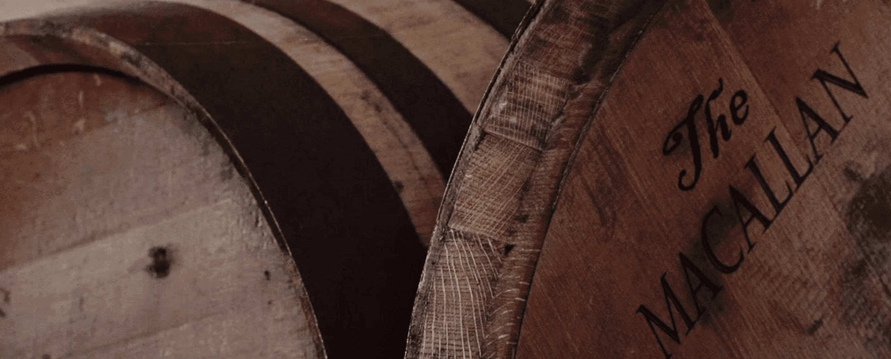
The Macallan
While at Baron & Baron in New York, I led the design and art direction of a comprehensive packaging redesign pitch for The Macallan, the renowned Highland Scotch whisky. The concept sought to reimagine the brand’s presence on shelf by distilling its visual language into a single, powerful geometric form - the triangle. Drawing inspiration from the architecture of the bottle itself, the triangular motif was amplified to become an instantly recognisable icon of the brand. The label was completely restructured around this form - bold, minimal, and unmistakably The Macallan - establishing a new visual signature rooted in heritage yet modern in expression.
The bottle design was also re-envisioned, with refined proportions and detailing to elevate the overall perception of craft and luxury. Together, the new bottle and label formed a cohesive identity system that honoured The Macallan’s Scottish origins while positioning it confidently within the contemporary luxury spirits market.